

How can users tour a gallery effortlessly?
In an age where companies are continually decreasing their usage of paper and switching towards an all-digital experience, a gap has formed for art galleries. Historically, galleries consistently offer visitors physical maps and display condensed label cards to describe exhibits and artworks.
Through user interviews, it was found that the upcoming solutions to digitizing gallery information were lacking in quality, usability and customizability. With these digital solutions, users are looking to be able to customize their in-gallery experience, participate in a seamless tour, and be presented with novel information about their visited works.
Roles
User reseach
Wireframing
Prototyping
Visual design
“I often forego audio tour aids because of the poor experience - either they use an unrealistic, robotic voice or they just read off of the text card”
- Participant from preliminary research study
This case study presents a look into the process of researching, designing, and prototyping a solution to offer gallery visitors a personalized tour.
Tour app users want...


It was initially hypothesized that users searched for a solution with advanced features, such as location tracking and AI scanning of the exhibits.
However, it was found through user interviews that the majority of audio tour aids weren’t meeting their more fundamental needs of being able to experience galleries at their own pace and own language in an engaging way.
Exploring and learning
The original scope...
Initially, the main focus was to create a touring experience that the user could completely customize.
It was found through the user studies that many users fell into two main groups in terms of their tour needs:
a visitor who wants to be able to customize their own experience.
a visitor who will use audio tour aids only if it’ll improve their experience.

Starting from the beginning of the touring experience, the first touch point that was wireframed was a landing page succinctly displaying galleries with a map view and a featured gallery based on proximity.
After selecting a gallery, the tours within that gallery were displayed, organized by floor.
Then, after a particular tour was selected, to allow users to have the most control over their tour, the first pain-point addressed was allowing users to edit the order of the clips in a tour before starting it. The hope was to suggest an order to the tour and give users the freedom to pick and choose the pieces within the exhibit that they are most interested in. In addition, a settings feature was added to allow users to select a language for both the audio and subtitles of the tour.
Rescoping...
Quickly after the first usability study, three main insights were determined:


It became clear that the preliminary iteration of the design diverged from the customization that the users truly needed; they expressed that they would rather be able to intuitively access the playback settings rather than dive into editing the tour contents if the tour was already presented in a logical order.
While in the user research they did express the wish to be able to customize their tour, really the gap in existing solutions was more basic - like the language and speed of playback, or even simply skipping a tour section.
“It’s a requirement that the tour is easily understandable in my language of choice.
Second, I would say, and pretty important to me is adjustable audio speed.”
- Participant from preliminary research study
To further focus the design scope, the app’s purpose shifted from connecting users to any gallery instead to a singular gallery in which users could express their topics of interest, be suggested tours suited for them, and seamlessly customize their tour in a non-invasive way.
This rescoping was also motivated by the first insight on gallery information - the initial iteration of the design lost focus on delivering the right option. The gallery homepage lacked a mechanism for users to make an informed decision. In the redesign, it was essential that the tour selection process was not overwhelming.
Refining the redesign
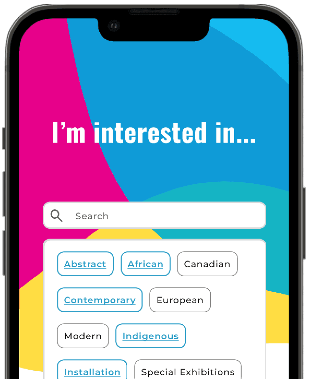
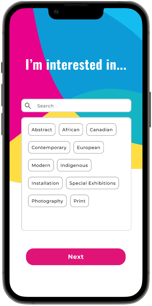
Interests
Based on the feedback from the initial user interviews, a survey of interests was added to help users decide on a tour.
Two benefits were drawn from this: a featured tour can be displayed based on the user’s interests and also topic tags can be highlighted to inform the user on whether a tour’s content aligns with their interests.

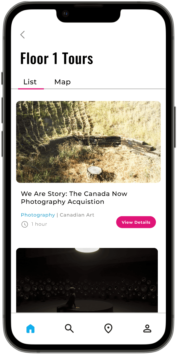
Per-floor tours
To enable users to quickly decide on a tour, a featured tour card is presented at the top of the frame. Otherwise, each tour has special interest topics highlighted to allow users to scan their options effortlessly. Per floor, each individual tour also displays the tour length to help users determine if a tour is suitable for them.

Interactive preview
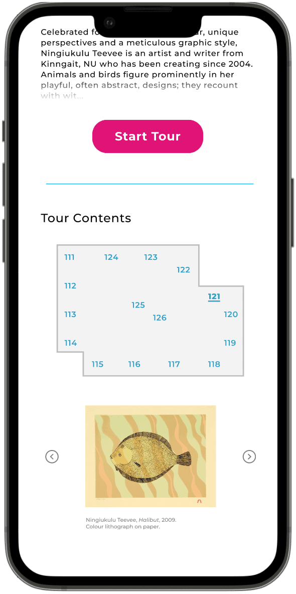
The tour details page's design was motivated by the user testing feedback relating to editing a tour’s content.
Users expressed that they would rather follow a tour with the suggested tour order if it already followed a logical progression. So, an interactive preview map was added for a visual overview of the tour to display what the order of the tour might be.

Playback settings
A familiar interface was designed for the playback screens so that users may apply their existing mental models.
From user testing, previous iterations of the design showed that users had difficulty navigating to the playback speed and language menus. In the updated design, both settings are readily accessible as is the transcript of the tour, below the audio interface.


Transcripts
To enhance both the usability and customizability of the app, both the audio and transcript language are customizable.


Future work
Create screens for the user to access their account details, including gallery member card and tickets.
Clearly link the interests selected in the initial survey with the highlighted topic chips for each tour.
Include a feature to bookmark or save a tour for later.
