An illustrated gif of a desk. Atop the desk are a monitor, laptop, and phone displaying a pink website.

Key Skills

Roles

  • Project Manager

  • UI Designer

  • UI/UX Engineer (for custom code)

Roles

  • Project Manager

  • UI Designer

  • UI/UX Engineer (for custom code)

Roles

  • Project Manager

  • UI Designer

  • UI/UX Engineer (for custom code)

Built With

  • Figma

  • Procreate

  • Square Online

  • CSS

Built With

  • Figma

  • Procreate

  • Square Online

  • CSS

Built With

  • Figma

  • Procreate

  • Square Online

  • CSS

This case study specifically highlights project management and visual design skills. Since the client did not yet have a design system or branding established, I led the visual design discussions and iterations. Also as the one initiating and suggesting the website redesign, I drove the project timeline and managed timely deliverables for both myself and also from the client.

My Deliverables

  • Design questionnaire

  • Wireframes

  • High-fidelity mock ups

  • Implementation

  • Launch

My Deliverables

  • Design questionnaire

  • Wireframes

  • High-fidelity mock ups

  • Implementation

  • Launch

My Deliverables

  • Design questionnaire

  • Wireframes

  • High-fidelity mock ups

  • Implementation

  • Launch

Client Deliverables

  • Product photos

  • Product descriptions

  • Copywriting for Care instructions

  • Copywriting for About Page

Client Deliverables

  • Product photos

  • Product descriptions

  • Copywriting for Care instructions

  • Copywriting for About Page

Client Deliverables

  • Product photos

  • Product descriptions

  • Copywriting for Care instructions

  • Copywriting for About Page

Client Interview and Research

The first important step was interviewing the client, Krafttee Crochet, and learning about their pain points with respect to the current version of the website. I interviewed the client with 3 main objectives:

1. What do you like about the current website?
2. What can be improved in the redesign?
3. What message and experience would you like to convey to your users?‍

From the client interview, I determined:

Message

Message

  • Krafttee creates their products with care and consideration, all by hand, and they wish to convey that care through their website to their customers

Likes

  • They want to provide the user with high context.

  • Care instructions and product details are extremely important for the user to properly treat the products after purchase.

  • Structure and categorization of products for an easy-to-navigate shopping experience are important in the next iteration of the site

Improvements

  • Visual branding should be established and be consistent throughout the website, as well as reflected on other social channels that Krafttee Crochet uses.

  • An accurate online inventory of products with both images and descriptions are needed to showcase their variety of products.

  • A consistent and visually appealing shopping experience on all device platforms must be established.

In order to create a redesign that continues to fulfill the desires of the first website,  improves in areas where it lacks, and deliver the core message of the client's business philosophy, I outlined a list of required changes:

  • Information Architecture

  • Home Page Redesign

  • Visual Design

  • Bridge the gaps within the user shopping experience

which also formed the project goals, below.

Project Goals

  • Establish a strong brand foundation for Krafttee Crochet's online retail platform

  • Design and deliver brand-consistent visual content to drive customer engagement

  • Create a complete, plentiful, and low-friction shopping experience, achieved through managed client deliverables

IA and Wireframing

The site was originally organized into 5 pages:

  • Home

  • Instagram

  • About us

  • Shipping

  • Shop

Information architecture for the original website. "Home" is the top most level and "Instagram", "About Us", "Shipping", and "Shop" are in the second level.

While the core of the information is present, I felt it was important to reorganize the presentation of the information to easily lead the user into the primary user journey (shopping) without distraction.

For example, the first page in the nav bar was for Instagram, which we determined in our discussions should have a place lower in the information architecture hierarchy as it takes the user away from the primary user shopping journey.

The original website home page with a navbar that lists "Instagram" after "Home".

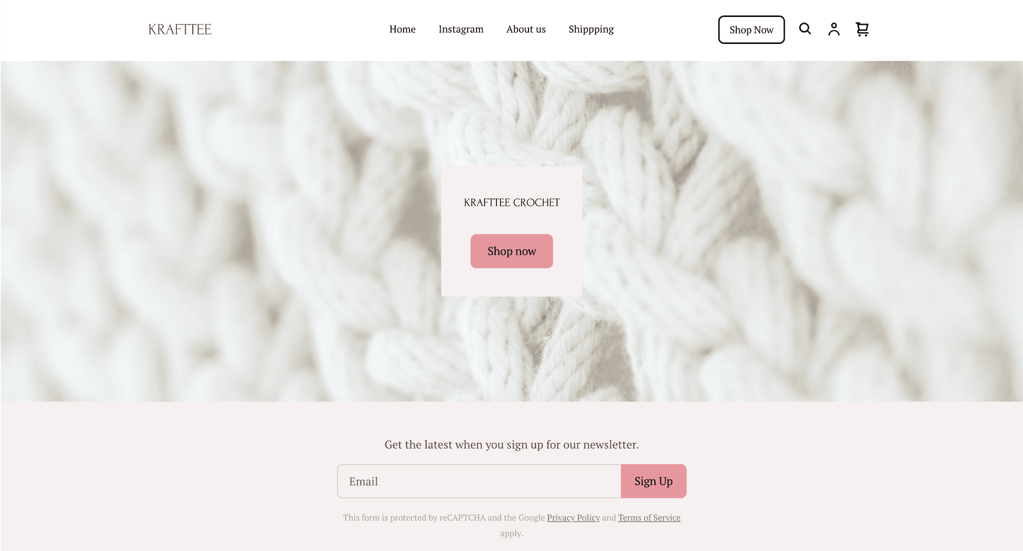
As well, the original version of the home page called the user to sign up for a newsletter before seeing the product collections section of the home page, likely distracting them from their initial user journey.

A website screenshot with a newsletter section above a "Collection" section displaying placeholder images of products.

With the shopping user journey in mind, I proposed the following information architecture instead‍:

The new information architecture for the proposed site redesign. There are 5 levels. Home is at the top most level. All the varieties of flowers are at the bottom most level.

This new information architecture focuses on foremost displaying the client's products so that the user can easily and quickly access the array of products to browse. It then prioritizes the secondary focus of establishing the client's brand of being a local, small business - with an emphasis on care for its products - by listing the About, Shipping, and Care Instructions before the Instagram page. Finally, the Shop page is emphasized in the nav bar with a Call to Action (CTA) button to Shop All products.

Paper wireframe for the home and shop web pages.
Paper wireframe for the About and FAQ pages.
Paper wireframe for the banner image.
Paper wireframe with the final proposed layout for the banner image.

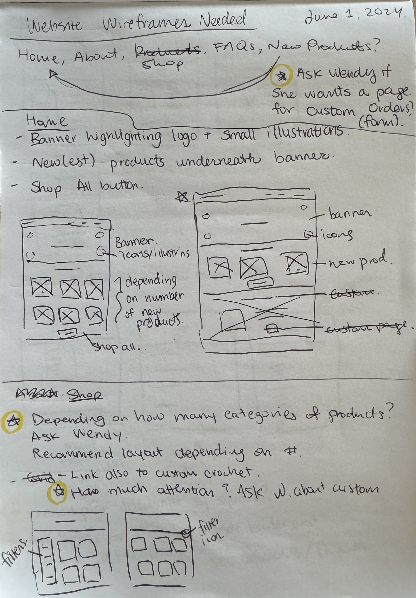
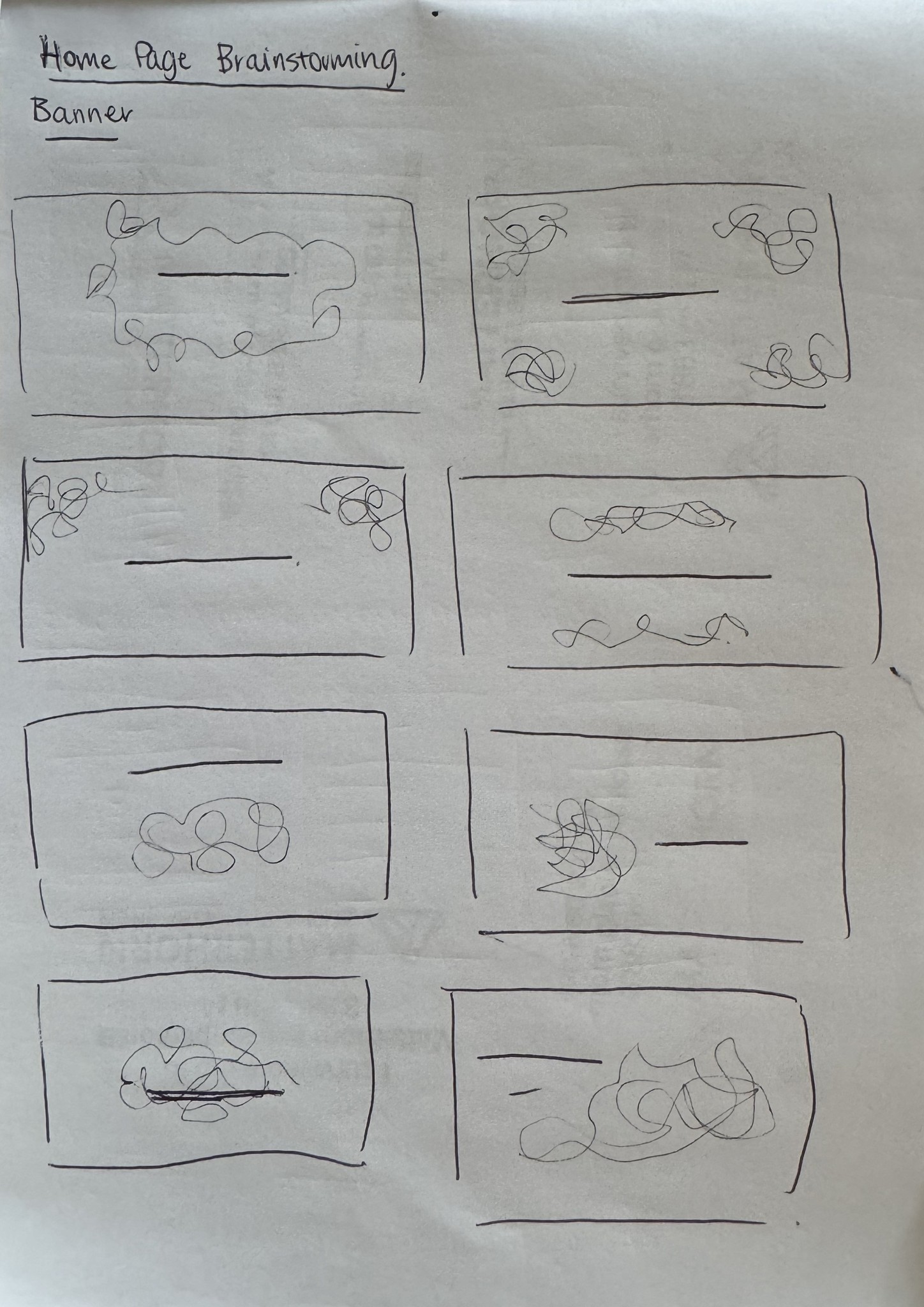
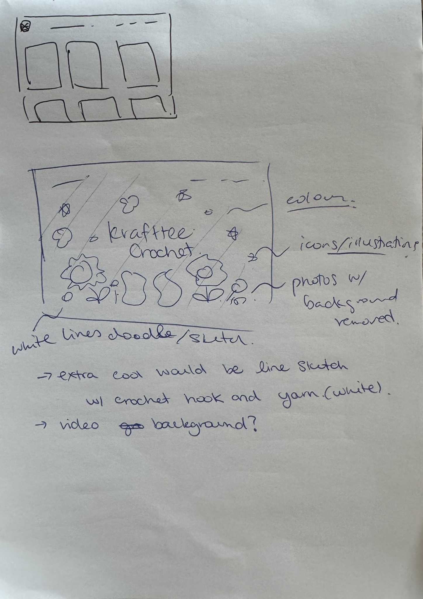
From there, I created paper wireframes to quickly ideate on versions of the home page that were conducive to displaying featured products and the wide variety of inventory, to invite the user to explore more of Krafttee's products.

Lo-fi digital wireframe for the home page.
Lofi digital wireframe for the Shop page.
Lo-fi wireframe for the About page.

I converted the paper wireframes to lo-fi digital wireframes for the home page, shop page, and about me page and sent these to Krafttee for a preliminary review to request feedback.

Design Questionnaire

After a a few consultations with the client in which I outlined the key deliverables (from both sides), proposed Information Architecture, and proposed wireframes, I then created a design questionnaire to gather specific information about their target audience, preferred aesthetics, and functional requirements. This questionnaire helped not only to ensure that I was aligned in my understanding of the client’s needs, but also gave the client an opportunity to think deeply and specifically on what they would like for their site based on their own philosophies.

From my synthesis of Krafttee's questionnaire answers, I determined that the visual design and branding should emphasize:

1. Color

  • Pastels evoke a calming feeling similar to that which the product evokes.

  • .

1. Color

  • Pastels evoke a calming feeling similar to that which the product evokes.

  • .

  • Pastels evoke a calming feeling similar to that which the product evokes.

  • .

2. Font

  • The client preferred handwritten and sans-serif fonts which reflect the handmade nature of their products.

  • Sans-serif fonts in particular give a sense of modernity and minimalism.

  • The client preferred handwritten and sans-serif fonts which reflect the handmade nature of their products.

  • Sans-serif fonts in particular give a sense of modernity and minimalism.

2. Font

  • The client preferred handwritten and sans-serif fonts which reflect the handmade nature of their products.

  • Sans-serif fonts in particular give a sense of modernity and minimalism.

3. Product Highlights

  • Based on a competitive audit and inspiration sources from the client, I determined the client is interested in banner images that display the product clearly and upfront.

  • Based on a competitive audit and inspiration sources from the client, I determined the client is interested in banner images that display the product clearly and upfront.

3. Product Highlights

  • Based on a competitive audit and inspiration sources from the client, I determined the client is interested in banner images that display the product clearly and upfront.

Responsiveness Adjustments and Custom Code

After a few design discussion calls with the client, we finalized the designs of the home page, products page, and information pages. I then collaborated with the client to collect product descriptions, images, and other necessary copy to add to the website. To help move the project timeline along, I offered to do the initial upload of all online inventory photos, descriptions, and I organized the inventory into their categories, with their category cover photos, according to the Information Architecture laid out earlier.With the initial implementation complete based on the wireframes and design system, I conducted thorough testing to assess responsiveness.

The main limitation with the Square Online platform was its inability to allow for customization on the banner image. As reported from the client, most customers are visiting the site from mobile devices. However, in prioritizing a banner image that is visually appealing on mobile, the desktop experience is left with a banner image with a skewed aspect ratio.

To resolve this, I added in custom code into the website through a workaround. The Square Online platform has a single option to add custom code for tracking and analytics on your site. I used this entry point to inject custom CSS and select one of 3 options for displaying a banner image - either for mobile, desktop, or wide viewing devices. Knowing this is was unconventional way of modifying the banner image, I created handoff documentation for the client (see section Handoff).

A collage of 3 device platforms displaying the home page with text and banner image adjusted to appropriate sizes for each platform.

User Shopping Journey

Mobile User Journey

With the responsiveness issue resolved through my workaround, all inventory photos uploaded, and all written copy added, the site was ready to be published and experienced on all platforms at kraftteecrochet.com!

Impact: Laying the Groundwork for Growth

The redesign of Krafttee Crochet's website has resulted in a critical shift from zero to measurable engagement and conversions, setting the stage for future growth.

From Zero to Measurable Conversion

Prior to the redesign, the website experienced a 0% conversion rate. The new site now sees a 0.19% conversion rate, demonstrating a 100% improvement. This crucial change indicates that the new user experience is effective in driving sales.

Engagement

The 'Add to Cart' count, which was previously at zero, have seen a 100% increase. This significant improvement (from 0 to 5 'Add to Carts' and 0% to 0.95% 'Add to Cart' rate) shows that customers are now actively engaging with the products.

A screenshot of Conversion Rate, Add to Cart Count, and Add to Cart Rate metrics all with 100% improvements.

Increased Exploration

A 19.05% increase in page views per unique visit (from 4.5 to 5.3) indicates that users are exploring more of the website's content, highlighting improved navigation and site structure.

A screenshot of the Page View Per Unique Visit metric with a 19.05% increase.

‍‍‍Looking Ahead

While the current numbers are modest, the 100% improvements from zero represent a turning point for Krafttee Crochet. The redesign has successfully laid the groundwork for future growth by creating a functional and engaging online presence. Future strategies (taken by the client, outside of the scope of my design work) could focus on increasing website traffic through targeted social media campaigns, and search engine optimization.

Happy Feedback and Handoff

After a very productive design process, the owner of Krafttee Crochet and I met for the first time in person! She very sweetly gifted me a crochet handbag (which is featured in the hero image of this very case study). I also seeked feedback from her, to which she followed with:

"I showed my family and friends the website and all of them love it.
I got some compliments from my customers too."

Pulling from my experience as a software engineer , I knew that there was one final, important step needed to complete this process: a documentation handoff. Since I personally uploaded the vast majority of the items in their inventory onto the Square Online platform, I included a detailed link explaining how they would be able to continue to update their inventory over time. As well, crucially, I outlined in detail, the steps required to modify the banner image which requires specific updates to custom code for the responsiveness workaround. Finally, the handoff also included all high-resolution visual assets (banner in all sizes, logo, favicon). The client also wished to use the background of the digital banner image as their physical banner for markets!

Reflections

System Tool Level Constraints

While I aimed to incorporate advanced features like video banners, custom animations, and more refined control over mobile vs. desktop experiences, the limitations of both time and the Square Online platform restricted some of these design elements. Square Online’s customization options, particularly around custom fonts and complex interactions, proved to be more restrictive than anticipated.

Leveraging diverse skills

Despite these constraints, I was able to focus on creating an optimized, user-friendly design within the platform’s capabilities while also pushing the limitations of the system by being creative and leveraging my software engineering background.

Leveraging diverse skills

Despite these constraints, I was able to focus on creating an optimized, user-friendly design within the platform’s capabilities while also pushing the limitations of the system by being creative and leveraging my software engineering background.

Leveraging diverse skills

Despite these constraints, I was able to focus on creating an optimized, user-friendly design within the platform’s capabilities while also pushing the limitations of the system by being creative and leveraging my software engineering background.

Communication with your stakeholders

This experience highlighted the importance of balancing ambition with the technical limitations of the tools at hand and reinforced the value of setting realistic expectations with clients early on. In future projects, I would consider suggesting exploring platforms offering greater flexibility for the most lush design experience, if the project calls for it and if their budget allows.

let’s build something great together :)

designed and implemented by Susan Wang © 2025

let’s build something great together :)

designed and implemented by Susan Wang © 2025